
The project prioritization trap
Escaping name-dropping politics without drowning in over-engineered scoring models


One of the most difficult challenges I have encountered in my career has been prioritizing projects in a decent way. A project scorecard is one step forward from a purely qualitative stakeholder workshop toward a more quantitative assessment. The goal of having a project scorecard is not to replace human judgment when prioritizing projects, but to provide metrics to compare competing initiatives and strike the right balance between total randomness and analysis paralysis.
One extreme is when prioritization is name-dropping-based. “That VP wants it done” or “the CFO asked for it”. Name dropping is a simple way for stakeholders to get things done without having to justify the value or business impact of an initiative, and the highest name in the org chart wins. There are strong incentives for stakeholders to do this to please their leadership chain, so you need strong air cover from your own leadership to prevent it. If your leadership is weak and does not really understand what the Data team is supposed to do, you are in a bad spot and it will be hard to push back.
The other extreme is when prioritization becomes too complex, requiring excessive effort to analyze impact, effort, and other factors. Douglas W. Hubbard, in How to Measure Anything, argues that if something is important for the business, it can be measured, even if it seems impossible at first. This principle does not mean that everything should be measured, because measurement is not free, it requires work. However, if the information value of estimating certain variables related to a project proposal (e.g. financial impact or number of resources needed) is high enough, then measuring the project with a scorecard is justified.
In theory, the measurability principle forces the business to think hard about what is truly important and worth the effort of quantifying (both the current state and the realistic improvement we can expect from an initiative). I like the theory, but I admit it is very hard to put into practice.
Take a classic Data team output: a dashboard. How do you measure if it is worth maintaining and extending a dashboard? The ultimate measure is the business impact of decisions influenced by its usage. The user would have to track how decision Y (e.g. changing the checkout process of an eCommerce site) resulted in business impact Z (e.g. revenue increased by 10%), and how much that decision was influenced by having access to dashboard X. Establishing the Y → Z causal link is already difficult, as it requires experimentation to isolate the true impact. Going upstream to determine X → Z is even harder and far more qualitative. It would require the user to introspect on how much their decision-making was influenced by the data in the dashboard. In the end, the only viable option is often to measure usage (e.g., weekly active users), which is an imperfect proxy. A niche dashboard used by a small team (e.g. Finance) can be more impactful than a generic one with a broader audience and a “for information” flavor.
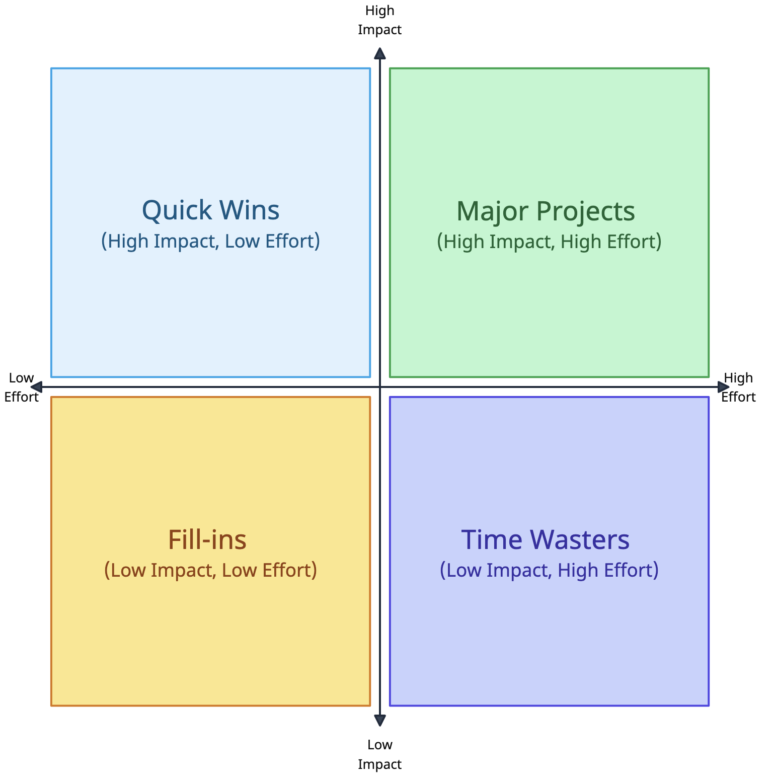
Nevertheless, it is important to move away from fully name-dropping-based prioritization. The absolute minimum is an effort-vs-impact quadrant. This is easy and fast, but it does not protect you from name-dropping risks. The danger is that “impact” becomes a synonym for “who is asking”, so the higher the requester in the org chart, the higher the supposed impact.
A more refined approach is the RICE score, which stands for Reach, Impact, Confidence, and Effort.
Reach: size of the user base affected by the project.
Impact: magnitude of the effect on those users.
Confidence: accuracy of the Reach and Impact estimates.
Effort: resources required to implement the project.
Impact is usually scored as 0.25 (minimal), 0.5 (low), 1 (medium), 2 (high), 3 (massive). Confidence is typically 50% (low), 80% (medium), 100% (high). The final RICE score is (R × I × C) / E.
The RICE score is a good compromise, especially if stakeholders are not used to quantitative evaluation. One limitation is that it was designed for software development to assess feature shipping for external users, which may number in the thousands or millions. Data projects can be external-facing (e.g. a product recommender engine) or internal-facing (e.g. a supply chain forecasting model). In these cases, you need a relative measure for Reach that allows fair comparison (for example, % of the customer base for external projects and % of employees for internal ones).
If your stakeholders are ready for more sophistication, you can use a more comprehensive and bespoke scorecard. You define 3 areas of interest (e.g. Operational, Technical, Business) and 3 criteria per each ares (9 in total). You score each criterion on a 1–5 Likert scale, with specific semantic definitions for each score. You can sum these scores into a single number, or visualize them in a radar chart to compare project profiles.
Below an example:
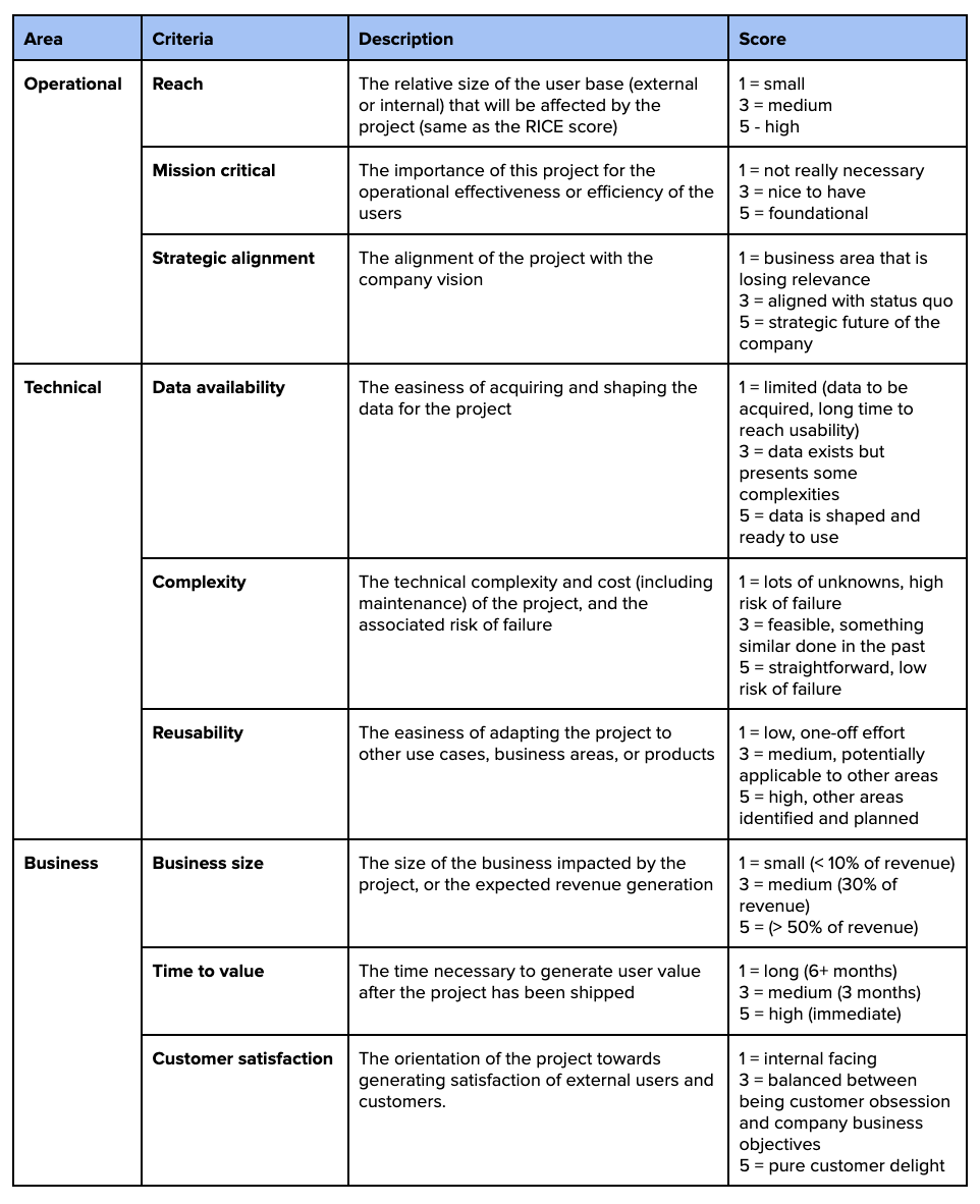
The Areas and Criteria are arbitrary, and they should reflect what the business considers important for the direction of the company, and relevant for the corporate culture.
If you want to go ballistic, you can define weights for each of these criteria, to account for the fact that the company might value some more than others. In that case the final score of a project proposal would be the weighted sum of all criteria, instead of a simple sum.
A nice way to define the weights is to pitch each criteria against all the others in a pairwise comparison, and give a 1 to the criteria that is more important, and a 0 to the less important one in the pairwise comparison. For example, in the table below, “Reach” (C1) is compared against “Mission critical” (C2) and considered more important, so we put a 1 in row C1-column C2, and automatically a 0 in row C2-column C1. We only need to fill the upper part of the table, and the lower part is determined automatically. By summing the value in each row we obtain the total score of each criteria (e.g. 4 for C1, 6 or C2 etc), which we then divide by the sum of scores to obtain a % weight.
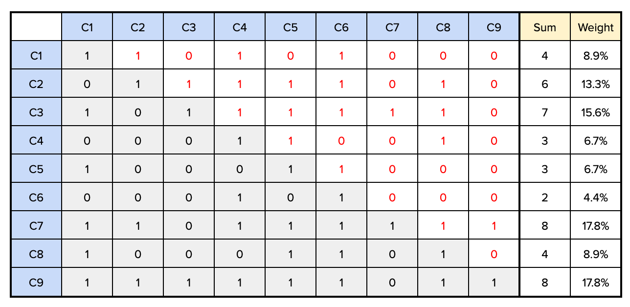
As you might have noticed, C1 was considered more important than C2, but it ended up with a lower weight than C2. Pairwise comparison does not require nor enforce transitive consistency, but avoid too much inconsistency.
This should be done with executives and stakeholder representatives. It surfaces what the business values and sets clear prioritization rules. Once the rules are signed off, nobody can complain about the process. While scoring remains subjective and can be gamed, a scorecard forces assumptions into the open, making unrealistic ones harder to defend. Stakeholders can still pull rank, but the added friction and transparency act as balancing factors.
Do you like this post? Of course you do. Share it on Twitter/X, LinkedIn and HackerNews